Wednesday, 29 August 2012

Jo Bloggs...


If you are think that all the artistic creations that come home from school with your children, all the clay piggy-banks, moody self-portraits and whacky surrealist explosions are going nowhere, then I urge you to cram yourself into the back-room at the Victoria and Albert Museum where the Thomas Heatherwick exhibition currently shows the direct route from squeezing play dough through a plastic mould and enjoying the curly, mushy shapes that come out, to the multi award winning design firm whose groundbreaking creations topped the stunning Olympic ceremony - particularly the flame design. On show is the original model of the flame. It does look rather like it might have sat on your teenager's desk as an ambitious, but zany school project; when revealed at the peak of the ceremony, more than anything that had preceded it, his realisation of the idea of the eternal torch carried by all the nations taking part, took the breath away from a billion viewers around the world, as the individual petals of bronze rose to form one roaring flower of light - symbolism not even lost on a pre-occupied sixth former, and beautifully simple; moreover, it answered that nagging question - 'how could this Olympics ever be individual, representative, and  creative on a global stage after the 'star wars' scale of Beijing?'
 
 
The notes and ideas that permeate Heatherwick's studio are a testament to the purity of his ethic - all different disciplines within the studio are physically and creatively on a level, so that a kind of democracy of innovation means that the designs leave behind the usual strictures of any single discipline - the rolling bridge they made for paddington basin is artistically pleasing as much as it is a triumph of modern material, but also basic maths and engineering.


 The cafe at Littlehampton is amusing in design and commercial, but beyond original in the way it's architecture fits the lines of the long beach. Everyone knows who eats there that they are in Barney rubbles house for fish and chips, but like the best creation you think this is so simple, I could have done it. But we didn't, he did.
 
 
 However, maybe our children will too, if we can facilitate passing on the baton, the one already handed from Brunel through Turing and Jonathan Ive (the british designer of the iPhone) and onto Thomas Heatherwick - 'workshop UK,' a small but
perfectly formed hotbed of originality.


Sent from my iPhone

Saturday, 4 August 2012

Jo Blogs...


What first textures do we know?
A mother's skin..
Food, the carpet, a teddy bear.
The patterns of television, nursery curtains, grass when we are left out to play,
In my other job, I have been asked about ten times in the past year to voice an animation in the style of this one at Fiat
http://www.fiat.co.uk/ecodrive/#ecodrive/intro
And each time the creators feel they are working with an influence that is current and entirely original. It intrigues me that styles, not just visual, but ways of seeing and of re-creatimg, and of reacting to the world, run like layers of rock, folding with time and sometimes bursting to the surface to dominate, seemingly from nowhere; but actually each current or influence in our way of seeing can be traced back.
When a group of talented animators fled the soviet union from Chechoslovakia in the 60s the story, if I remember correctly goes, the BBC bought a job-lot at the cheapest price, and they became our staple visual language, possibly absorbed by the creatives of the next 30 years from the carpet where we watched the telly.
(a card from our current collection -designed recently, but influenced by the czech
imports.)
(logo for the famous czech animation studio, that survived persecution, 'the trick brothers')


The work was characterised as non-violent, childlike, and distinctly and deliberately un-Disney.
The gentle colurs and shapes even now speak of  a different tradition, an intelectual, possibly left-leaning tradition. There is a hint of public broadcast about them, which may have arisen from a political situation where overt expression without common responsibility was impossible. This in turn suited, or possibly informed the very character of my generation's impression of early viewing, and the Paternal feel of media in those days - this may also be what attracts advertisers of today to evoke,  parody, and borrow these undercurrents.
  Possibly the methods of delivery were dictated by financial constraints, and local traditions of water-colour - but many of the particular characteristics are so specific to the culture were they arose that I as an outsider cannot identify.


 (two above, a cartoon from 1970s prague, and below one of our national favorites, the little princess - the similarities are striking.)

Not least the hugely influential Heinz edelmann (who illustrated the Yellow Submarine)


. And this set of images, this mode of seeing, lay dormant until the toddlers of that generation grew up and came to prominence in their chosen field, in this case advertising and animation, and a zeitgeist is born.


 Festival of Britain images from the 1950s, which are again so poular in design, in turn were evocative of sceintific, microscopic ages, and the advances of understaing of the natural world that were emerging at the time of their first fabrication.

(fabric pattern inspired by scientific advances in the early nuclear age)

 If you are of a different generation, your zeitgeist is different altogether but arose without announcing itself, but with the unanimous recognition of your peers, and the delightful bafflement of outsiders. And it is almst impossible, if you are outside a group of recognition, to understand what those inside it are acknowledging, what they are remembering and why it can have significance.
Maybe for you its graffiti, and associations with rap music, or the iconic album covers of the Sex Pistols;  or Che Guevara, or Burne-Jones.  It’s the same with comedy - I watch my son delight at the Mighty Boosh –

 and I distrust, detest and am bored by it; but it is no less peculiar than Michael palin dressed as a woman, or Harry Secombe and his honking opera voices which used to crack my dad up.

  I look at pictures my older brother and his friends aged 16 wearing bovver boy, high-waisted side buttoned baggies

 – I mean, what can they possibly have been thinking, but something in the style made sense to them, though for the life of me  I can't imagine what. I am equally guilty, since I knew exactly what Adam Ant was on about with his war paint, the dandy highwayman! but am not sure of the origins of this curse; however there was a series of ladybird books around at the time that I and Adam Ant were growing up, and one of the series was 'Pirates', and, if I remember rightly, the book went out of its way to make these robbers seem heroic and exciting.


 Maybe that emotionally warped a generation of school children, and left them vulnerable to psuedo native/clannish rock nonsense.


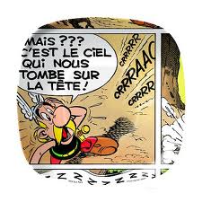
 We  have melamine 'Asterix' trays and mugs, aimed at children, but definitely favoured by 40-year- olds for themselves, because it is their own icon. Equally, the chopper bag.


I am sure the day will come with our business at Sugarbag Bue when people look at the stuff we stock and say'
'what on earth were they thinking?'
 –hopefully by then, like all wise people we will have had the wisdom to hand the choosing on to someone else!